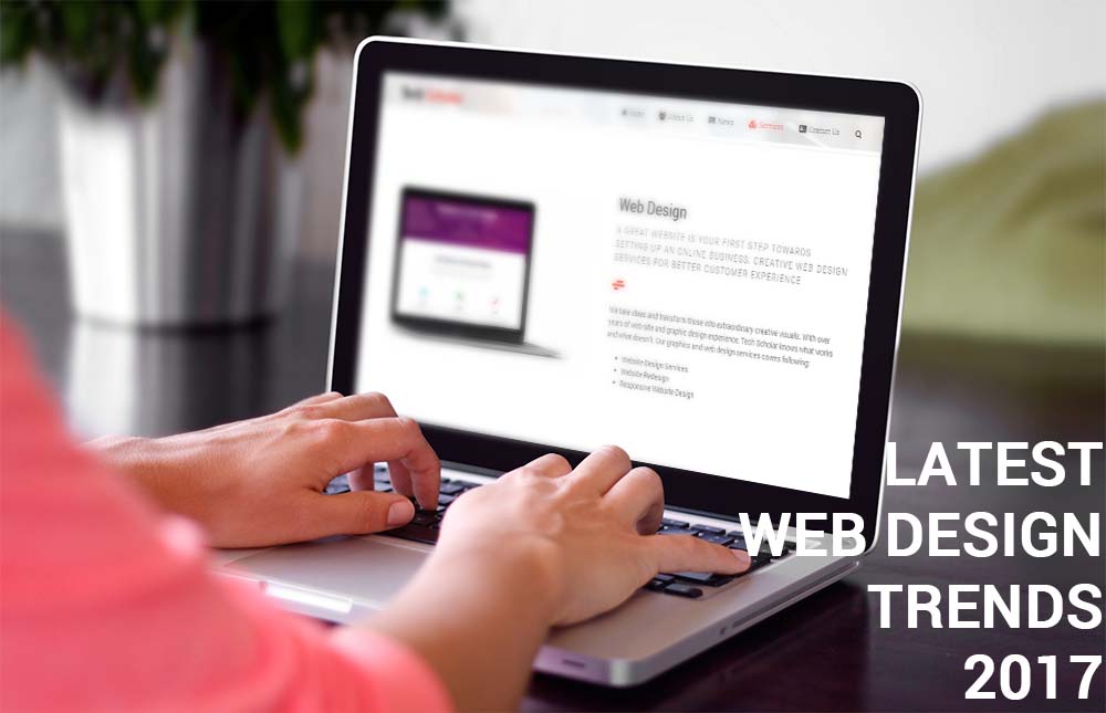
A s the technology progresses and becomes more ingrained into every facet of our daily lives, users are demanding more and more from their online user experiences (UX).
Personal, interactive, and relevant are three keywords which users find in their user experiences. Which ultimately means web designers now face the challenge of developing a website which recognises and replies to its users throughout the process.
1. The end of traditional web design
The concept of web design in the traditional sense is disappearing. In traditional web design, the role of the design was more to make the tech look good to its viewers.
Web design is more than that. It has transformed into something bigger.
Web designers (or experience designers) no longer just make websites “look beautiful”. Rather they need to look into the experience of users and their stories.
2. Conversational UI
As messaging platforms (such as Slack, Facebook Messenger, or WeChat) are surpassing social networks and app downloads, companies are starting to think about ways on how to use this change.
Therefore the design of conversational user interfaces (for example for websites) will become an ever more important topic for most web designers in 2017.
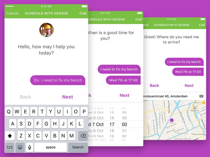
There are still a lot of questions unanswered, but rest assured: conversational interfaces and the experiences of those are becoming a big topic in 2017.
3. GIFs & other animations
A lot of websites and apps use animations for a while. What’s new is that GIFs are going mainstream.
As Ash from Buffer states:
GIFs are great. And they’re everywhere.
Now built into Facebook and Twitter, GIFs can also be used for your web design.
But don’t go to extremes – they work well to draw a user’s attention. GIFs enable you to provide a richer product experience, explain a workflow, or simply provide a how-to guide for your users.
And with numerous GIF creation tools (such as Photoshop, Giphy, or record.it) web designers are not limited in their design process.
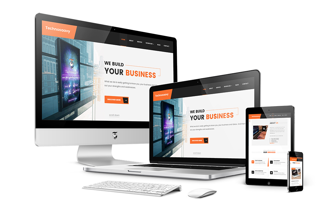
4. Next generation of responsive design
Responsive design will continue to take over because it is one of the most effective ways of achieving a good UX.
CSS media queries offer websites flexibility and allow them to adjust according to the different devices the site is being browsed on.
In April 2016, Google changed its ranking algorithm to line up websites which have optimized content and throughout the year, we’ll see companies hurrying to re-boost their Google ranks.
As website providers, we must accept the circumstances, though, that there’s not a one size fits all situation here.
5. Minimalistic web design
Minimalism is being taken to a whole new level in 2017, so instead of being hit with a homepage, users are now offered with a ‘card’.
These are entry points which act as the door to more information. Within a website itself, multiple cards can also be used to visually suggest a topic and tempt users to click.
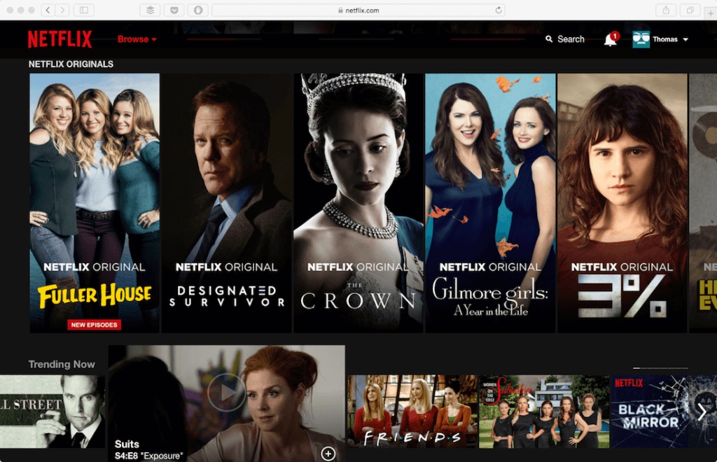
Netflix is an example of the website which has begun using cards with great success, the images explaining more about a show or movie than a short bio and using less space. This minimalism will also go for menus and navigation, both of which will be as simple as possible.
Mainly, people now want de-cluttered, simplistic, and visually explanatory web designs.
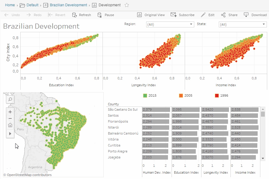
6. Data visualization
Data and analytics are more significant than ever and now big brands are offering their users a chance to see the stats for themselves.
Presenting data in visual ways increases user interaction with these information. Particularly useful when it comes to understanding user representation, colorful charts such as the ones you can create using Tableau, are eye-catching and draw user’s attention.
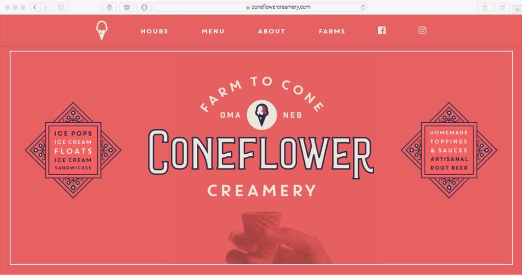
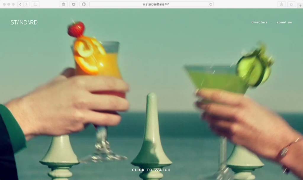
7. Fewer stock photos, more authenticity.
There’s an interesting web design trend worth mentioning. It’s quite a simple, yet curious one.
While browsing the web in the past few months, I do have the feeling that we see a decline in stock photos on websites. As people, we do prefer to see tailored pictures which really relate to the company or business, rather than a generic image.
I also have the feeling that web designers would rather use no image at all when using a stock photo.
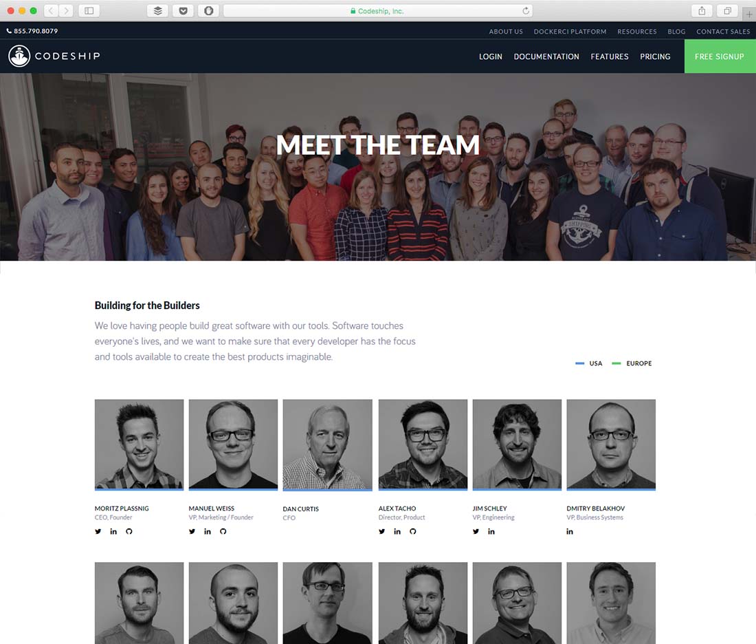
Photography is an art form and one which possibly got a little lost for a few years. But in 2017 it’s back and more influential than ever before. The essential thing to remember however is that your website serves a purpose and therefore everything on it, including the image, must do so too.
Images of your people (meet the team) are popular too – put a face to the brand.
Not only authentic imagery is on the rise. Cartoons, comic strips and other illustrations are too. Especially among tech communities, a comic strip can be a great format to discuss a particular topic or explain something in detail.
8. Material design
The material design has been developed by Google in recent years and is being progressively rolled out across its applications, including Gmail, Google Maps, Google Drive, and YouTube.
Material design shows up as a search term since early 2013, however, it only went mainstream in 2015.
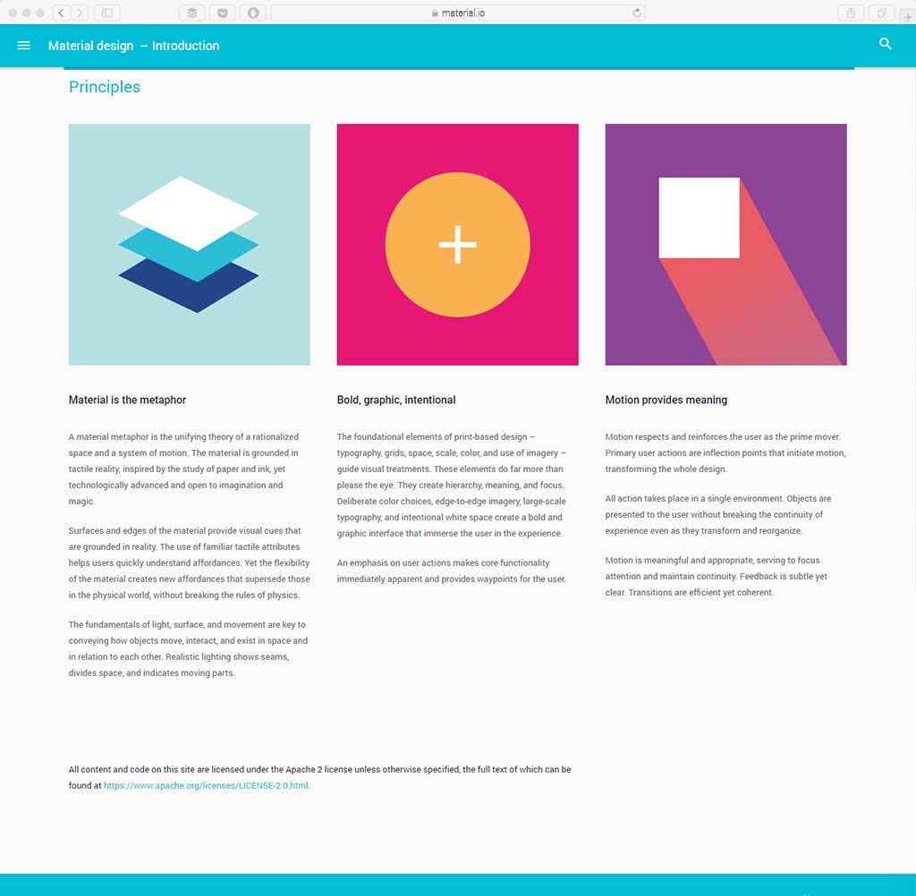
It is a way of designing to create a hierarchy of meaning and significance on the page, drawing the user’s focus to different areas all the while moving and responding to the user’s actions. They’re calling the latter Material Motion. The material design uses geometric shapes to visually enhance their site, create depth, and realism. It’s becoming more and more popular across the rest of the web too, thanks to its ‘living’ status, its flexibility, and its compatibility across all devices.
There’s an ongoing discussion about Material Design and its future.
To learn more about Material design, check out Google’s introduction.
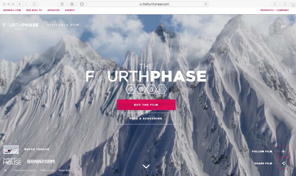
9. Long-scrolling websites
There are pros and cons to long-scrolling websites. In general, we do see more and more long-scrolling websites, mainly to the success of seemingly bottomless websites like Facebook, Twitter, or Instagram.
Facebook, Twitter, and Instagram allow users to scroll for hours, continuously seeing new content. As a human race, we’re used to the action now. Many sites are doing away with menus and tabs and instead of putting everything on one, long page. The site can be broken up into images, typography, and videos to add some enjoyment to the experience.
Better keep on scrolling.
10. Custom Typography goes big.
Typography is getting bigger and bolder.
Already 2016 saw an increase in size and ‘out-there’ designs but this trend isn’t stopping anytime soon.
Brands will be going bigger, more eye-catching, and even full screen. Big, bold lettering never goes out of style. It is one of those trends that seems to just get better and better. Thanks to a growing number of web fonts and compatibility, more designers are taking typography risks with more novelty and interesting typefaces.
It’s a win for the design and a win for users that are likely tiring of the same few sans serifs that seem to dominate design projects. From vintage type styles to retro looks to completely custom typefaces, designers need to think about how to add flair with type to create visual interest.
Dynamic colours and textures will be added to interesting and vibrant fonts to create an overall ‘wow’ effect.
It seems typography works well both to for drawing and keeping user’s attention. Large typography can be used effectively to break up the grids, especially if the site has a long scrolling page. Just keep in mind, cool lettering still needs to be readable. So whether you are pairing it with an image or as stand-alone artwork, make sure users can understand exactly what you are trying to say at a glance.
11. Gradients
Disappeared from the design landscape for a few years, gradients are making a major comeback. But the look of the color blurring technique has shifted.
In the last round of gradients, there were delicate variations throughout the design. Apple’s iOS icons were a prime example. Now, gradients are big, bold and use plenty of color.
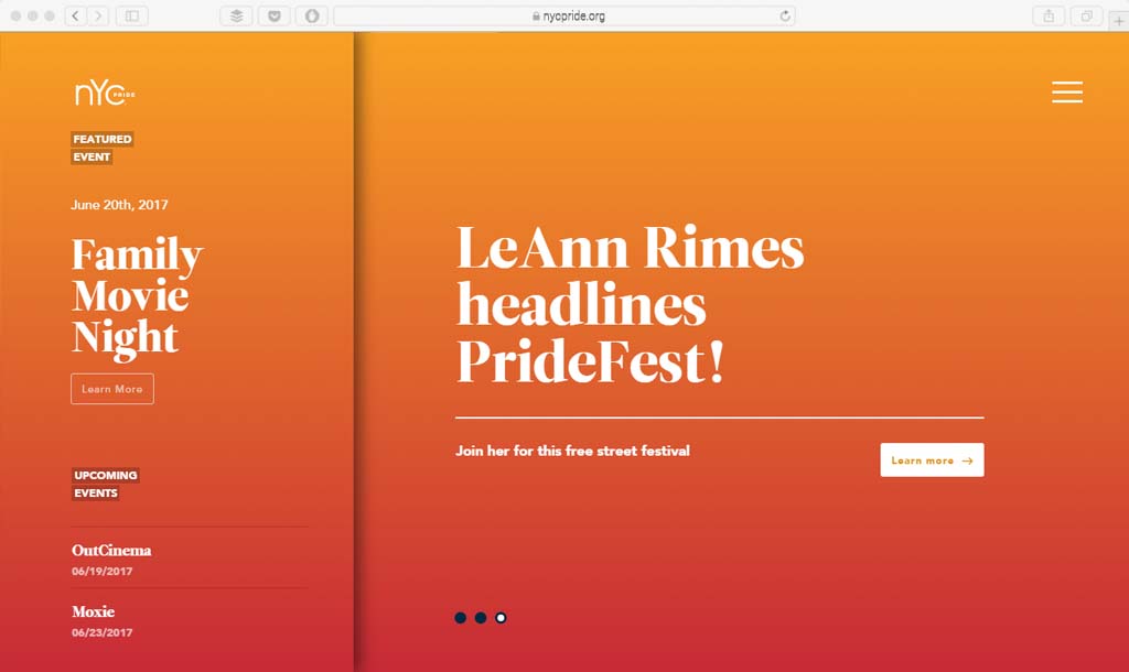
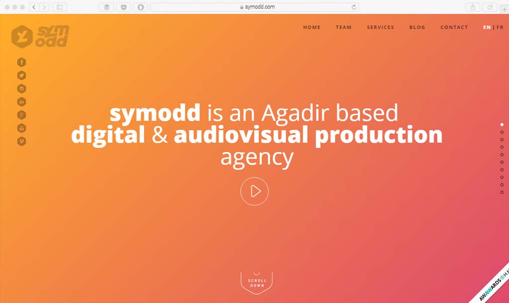
The most popular usage is a two-colour gradient overlay on photos. (This practice can look absolutely amazing!) It’s a great option to switch up your look or to make a less-than-interesting photo a little more interesting. You can also use a gradient background to draw the eye when you don’t have other imagery to work with.
12. Video with Sound
People are becoming more habituated to watching videos – from short bits of YouTube to movies – on their devices. Websites can copycat this cinematic experience as well with a full-on video with the sound display on the homepage. (It does not have to be auto-play to be effective.)
Proceed with caution. Include an option to toggle sound off and on, because not all users will appreciate it. The content needs to be so stellar that users will demand sound as part of the experience. (This is a trend that can be tough to pull off but can work beautifully if you have the right video and sound content combination.)
13. Virtual Reality (Almost)
Virtual Reality will possibly be the most talked about design element of 2017. With more devices on the market – and at affordable price points – VR is going to be big. Gamers will probably get the most out of VR initially, but it could definitely reach into marketing and other applications.
You’ll need to be ready to design for it. But moreover, you need to be ready to create virtual reality experiences that don’t require a headset. This includes website designs with 360-degree video and other highly interactive experiences with three-dimensional effects.
Anything that takes interaction to the next level will have that VR feel and be perfectly on-trend.
14. Even More Parallax
Parallax scrolling effects were a big trend in 2016 and designers have only gotten cleverer with these mouse-based movements. That trend will continue with more impressive – and fancier parallax effects.
Look for parallax effects that move up, rather than down, and movements that capture a much more layered design. The key to almost every design trend in 2017 is that touch of reality and parallax will be no exception. The more real the movement looks on the screen, the more users will want it.
15. Super Simple Homepages
More designs will start to strip away the type heavy homepage styles that have been popular for a while. More designers are opting for design that feature only a word or two on the first screen of the design.
And before you worry about SEO, these pages are often packed with plenty of information below the scroll. This is a great example of how user habits are changing web design as a whole. Thanks to plenty of scrolling on mobile websites, users are scrolling more on websites regardless of device. This makes it easier to design a light, airy hero area and pack the design with content on the scroll.
Here’s the trick: Just make sure to give users enough in this simple design to make them want more so that they will engage in scrolling behaviors.
16. New Navigation Patterns
Navigation does not have to be glued to the top of the design. From hidden or pop-out styles to navigation on the side or bottom of the pages, it is trendy to move the menu. (As long as the placement is still quite obvious.)
When considering a change to navigation styles, think about user patterns. Is the nav easy to find and does it work in a manner that users will understand intuitively? If so, go for it. If not, rethink the idea.
17. More Tactile Design
Web design is rooted in physical things. It started with Material Design and the development of more tactile planes and layering of objects. This interface trend is expanding to the visuals as well.
Designers are much more rooted in reality. This includes images, rather than illustrations, and plenty of elements that feel like the user can reach out and touch them. The images are more natural as well, featuring elements that are made from materials found in nature and crafted into usable objects.
18. Neutral Color Palettes
Tactile principles will carry over into color palettes as well. While the last two years have been some of the most colourful we have seen in web design that is going to shift to a more natural, neutral set of hues.
Look for more greens, beiges and muted tones in projects. Color palettes will be derived from the natural world and have less of a bold, bright, almost-neon look to them.
19. Wearables Influence the Web
Small design will influence everything else. Very much in the way a mobile-first design mentality has impacted the way all websites work, a wearable-first approach will most specifically impact app design. (You’ll want your app to work on a phone or a watch, right?)
This influence will likely change the look and complexity of some mobile apps. We might see larger typography and more minimal styles emerge. With so many users opting to buy wearables of some sort and wanting those interactions to replicate on other devices, this method of design is destined to happen sooner rather than later.
20. Micro-interactions
Microinteractions are subtle but powerful ways to interact with a website. They are often found in hovers, click animations, scrolling effects, etc. While we’ve always had these types of design elements, designers are spending more time on them, making them more informative and more refined.
Probably the most used integration is the hover/rollover, where a visitor can simply move their cursor over parts of the site to see these micro-interactions and interact with the site in that way.
21. More emphasis on landing pages, less on a home page
As we refine content and opt to market and share it more, in 2017 we will likely see a growth in landing page designs instead of a home page design. While every website needs a home page, I think that as content marketing spreads, marketers will want to direct traffic to dedicated landing pages to better target their visitors and their needs.
It makes sense: The idea of content marketing is to increase awareness and conversions, and what better way to increase conversions than to have visitors land on a page strictly made for them. These pages will be as well designed and thought out as others on the site, but target the visitor much more.
Wrapping it up.
2017 is sure to see some great websites, and these design trends will absolutely be seen on some of the best website designs yet to come.
From hand drawn elements to duotone images, imaginative headings to more focused content layouts, to microinteractions to animations, these design trends will dominate web design in 2017.
Whilst we think everything on this list is pretty great, don’t try and fit every single one of these trends into your new website.
Some will work for some companies, others won’t. Pick and choose which styles and capabilities your client both needs and wants. Trying to do too much will instantly decrease the UX of your website. So be selective, be careful, and, most importantly, be creative.
It’s going to be an incredibly exciting year for the web design industry. We will continue on the path of personalization, customization, and unique user experiences, making the online world ever more intuitive and human-like.
Meeting user expectations and delivering tailored experiences will be of paramount importance in 2017. Let’s make it happen!

Excellent website. Lots of useful information here, thanks in your effort! .
Amazing ideas for web design!
thanks for sharing
Thank you for sharing such beneficial information with us.
hellow….
You have discussed an interesting topic that everybody should know.
Very well explained with examples.
hellow…..
The blogs are really appreciable and one can trust the knowledge and information provided in the writing. The article you do produce on a weekly base really the best. I have found a similar website Digital marketing Sydney visit the site to know more about Sparkinteract.
hellow……
I got such a good information on this topic it’s a very interesting one. You made a good site and I have found a similar website,
please check this one Website Designing visit the site to know more about sparkinteract.