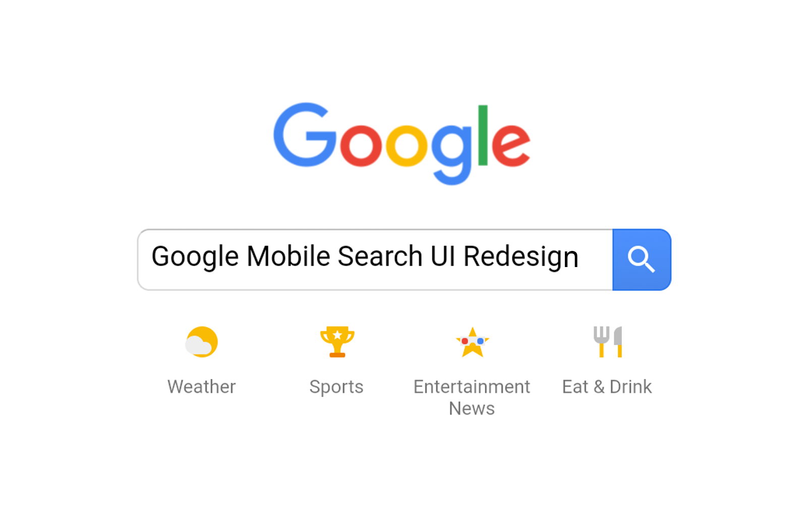
If you’ve searched for anything on your phone today you might have noticed that Google’s mobile homepage and search result pages look a little different. That’s because the search giant has begun rolling out a redesigned mobile interface.
Last month, the Google app began testing a rounded UI for both the Feed and Search results. In the last few days the latter design is widely rolling out to Google’s mobile site for both Android and iOS devices.


”You may not see the new UI in mobile search on your device just yet. Don't panic; it'll be a gradual rollout so it may take a few days to get to you.
Visiting the Google homepage or Search results on a mobile device, you’ll notice how the background is now bright white instead of light gray. Meanwhile, the search bar features rounded corners on the homepage, while the box with the category tabs at the top of Search results has also been rounded.
This curved treatment also applies to every card, including those for Top Stores, weather, sports scores, and various carousels. Meanwhile, link cards receive another partial tweak that uses a lighter blue font for page titles.


These designs have been in testing for the past several weeks, frequently visible when performing a search in Incognito Mode. However, beginning this afternoon, the new interface went live for those signed into their Google accounts.


Last month, this bright background and rounded buttons went live in Image Search on the mobile web. These changes are not yet live when searching through the Google app for Android, though we’ve already spotted them in testing.
This rounded design is live on every device and browser we’ve tried, including Chrome on Android and Safari on iOS. Pop in a search term and the curves keep on coming, as the category tabs and every card you can think of. That includes ‘Top Stories’, social, related searches, search suggestions, weather, sport results, and many other carousel cards.
Link text and titles have also been tweaked ever so slightly, with the blue shifting to a softer, lighter shade than before. In addition, the gray backgrounds we’ve gotten used to for so long now match the bright white cards in the foreground.
The search redesign appears to be live across all mobile platforms in multiple regions. We’re still waiting on the equivalent changes in the Google app, however, which not only includes the rounded cards and search bar, but also shifts the hamburger menu to the bottom navigation bar. That one will take some getting used to.
What do you think of the changes? Is it better than ever, or have Google gone a bit curve mad? Let us know in the comments!


